Logo Realignment
Illustration
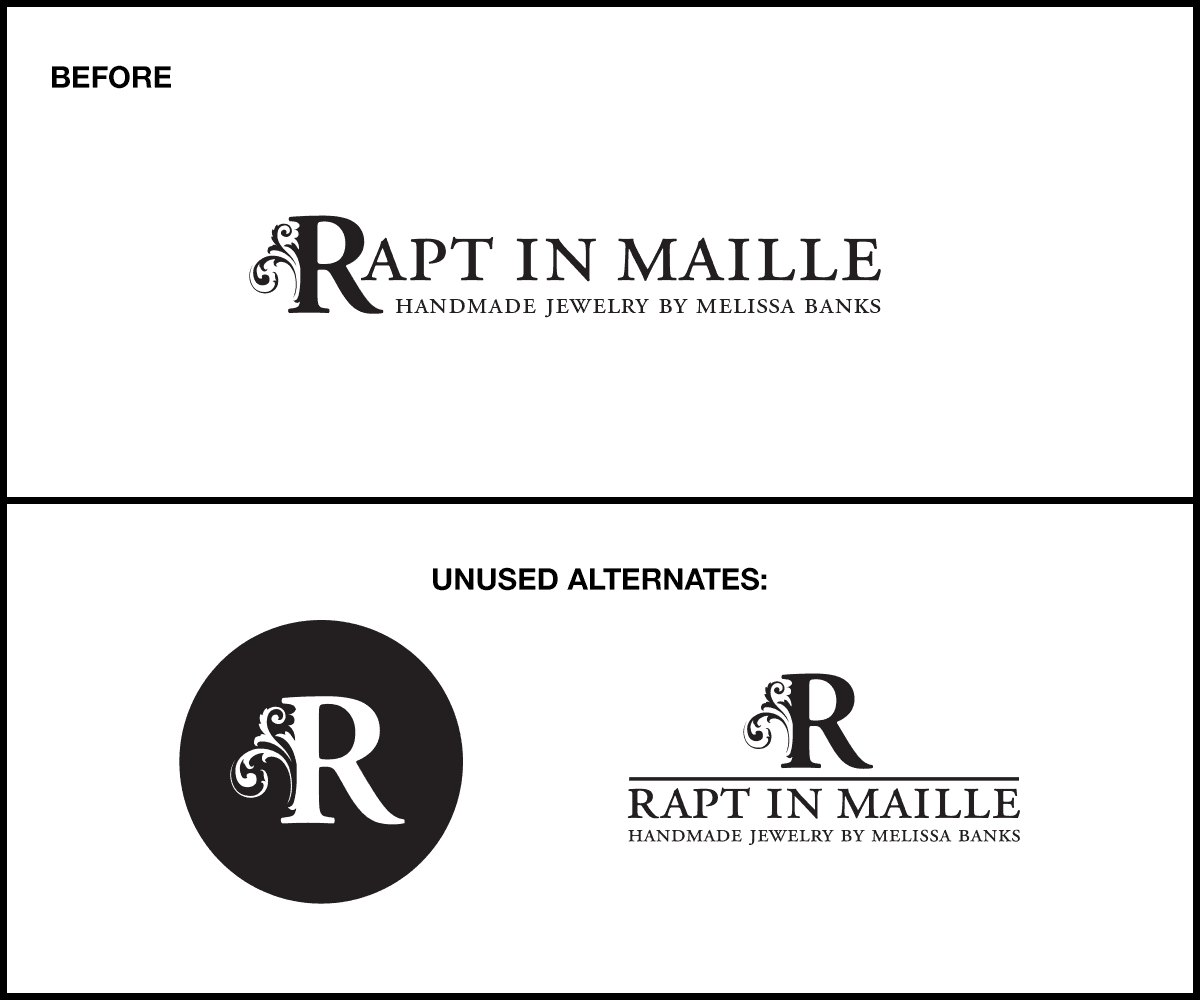
Logo realignment for client. Created simple 1-color artwork for web site & print during web site creation process.
Sometimes the best choice is to simply refine rather than abandon an established brand. Instead of completely redesigning existing logo, parts from previous designs were used to "realign" the logo. This update created a refreshed look with more modern feel while maintaining a clear tie to the past, so as not to abandon customer expectations.
Client
Rapt in Maille
Tools
Illustrator
Categories
Logo Design & Realignment
Original logo created by Sean Fermoyle of simpletypestudio.com